All my enthusiasm for this instantly died when I saw that interior, especially the monolithic screen
They had all the tactile buttons and switches right there, and they forsook them for a flat, unresponsive panel
Yeah I’m hoping they will make an adjustment in the future. I don’t like the all in one screens. In my area, it gets very very hot, so those screens need to get replaced/repaired on other car models.
I don’t think it’s a monolithic screen, there’s multiple screens. Even one with a piano down by the gear shifter.
Multiple screens isn’t any better unfortunately, you still have to look at the things to know what you are doing
Love retro sedans, hope some of the themes make it to market. Hyundai has been crushing it with design, IMO the Ioniqs are the best futuristic looking cars without being too out there. The N Vision 74 is a nostalgia fans dream.
That fucking reverse sound kills it for me tho…
This was my wallpaper for a while when I first saw it, I wish it would be possible to actually produce it because I would rather have it than like any other electric car
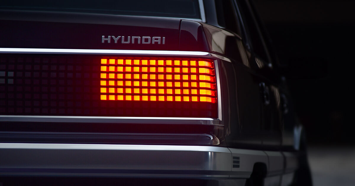
It looks like this is the same car, they note it’s badged as the Grandeur in other markets.
I’m a fan of the look of newer Hyundai models. The Ioniqs and this definitely move the brand away from the foreign budget brand they’ve been traditionally known as.
The only thing I don’t like about Hyundai at the moment is their outdated logo.
Dear Subaru…
If you’re gonna make a brick car at least base it off a good lookin brick like a Volvo 240. This thing is just horrid.
I really like this.
I agree. This thing looks awesome.
Here’s hoping the “virtual piano” (located dangerously near to the shifter) only works when the car is in park.
Lee Iaccoca, is that you?
That car is so ugly I thought this was some sort of old April Fool’s pic.
Did they really make an “updated” car that looks 40 years old?
It’s a concept car made by retrofitting a 40 year old car, not an actual production car. But also I don’t understand how anyone could think it’s ugly, it looks so much better than like 90% of the horrible looking cars companies make now
I like the futuristic touches but not a fan of the chrome body trim and grille. It looks exactly like an old Chrysler sedan of the K-car era.


