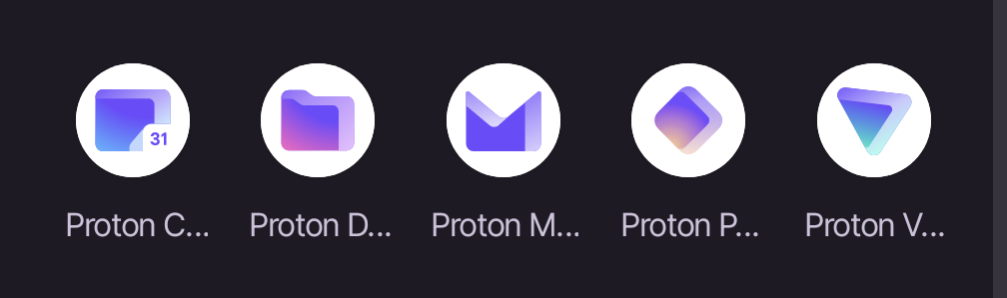
That the labels for the apps get truncated so you can only read “Proton” plus the first letter of the app. I’m only able to distinguish based on the icons which isn’t great because Pass and Drive are similar colors, and Pass and VPN, and Drive and Calendar are similar shapes.
idk why they shoved it right in the start, i mean i just want to check my mails man, if i want to check out proton drive or other stuff i will access them from the side bar or menu. kinda annoying move.