BlackRose@slrpnk.net to Data Is Beautiful@lemmy.mlEnglish · 11 months agoEarth's land Mammals by weightimgs.xkcd.comimagemessage-square13fedilinkarrow-up124arrow-down12
arrow-up122arrow-down1imageEarth's land Mammals by weightimgs.xkcd.comBlackRose@slrpnk.net to Data Is Beautiful@lemmy.mlEnglish · 11 months agomessage-square13fedilink
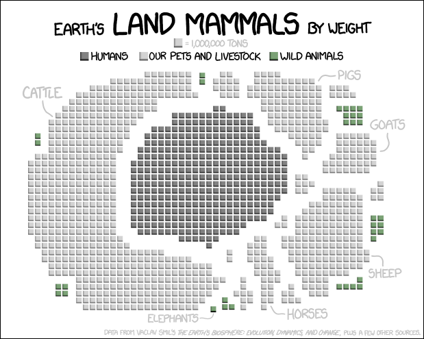
minus-squareSeaOtter@lemmy.calinkfedilinkEnglisharrow-up4arrow-down1·11 months agoInteresting data, but I don’t think it is beautifully presented. Bar charts, or maybe a blown up pie charts may be easier to grasp the scale. Blobs of the largely same color, dispersed in a random pattern make it hard to quickly see scale
minus-squareBlackRose@slrpnk.netOPlinkfedilinkEnglisharrow-up0arrow-down4·edit-211 months agoThe beautiful presentation was chosen to underline a message.
minus-squareianis@kbin.sociallinkfedilinkarrow-up2·11 months agowhich would have been a lot more clear in a bar chart
minus-squareBlackRose@slrpnk.netOPlinkfedilinkarrow-up0·edit-211 months agoIt’s like yesterdays post https://lemmy.ml/post/2352771 with a map of the US. The circle could represent earth.
minus-squareconductor@lemmy.mllinkfedilinkEnglisharrow-up1·11 months agoThis one wasn’t very good either.

Interesting data, but I don’t think it is beautifully presented. Bar charts, or maybe a blown up pie charts may be easier to grasp the scale.
Blobs of the largely same color, dispersed in a random pattern make it hard to quickly see scale
The beautiful presentation was chosen to underline a message.
which would have been a lot more clear in a bar chart
It’s like yesterdays post https://lemmy.ml/post/2352771 with a map of the US. The circle could represent earth.
This one wasn’t very good either.