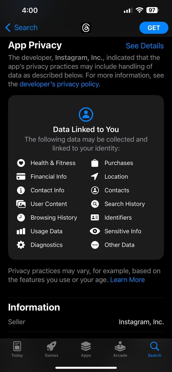
The user interface to display what is granted by using the app is… so sanitary. It disguises the ultimate goal of these insidious apps in such a clean and sterile list that it really seems innocuous. I wish that A$pple would start to display an intensity of how much data is collected by these apps. Green for good, red for bad, gradient for in-between. Or something… I suppose that accessibility for colorblind is important oto. Then it would be a bit more obvious to users when an app is really out to get them vs trying to improve performance.


Isn’t that just…everything?
Like is there anything they aren’t requesting?
The user interface to display what is granted by using the app is… so sanitary. It disguises the ultimate goal of these insidious apps in such a clean and sterile list that it really seems innocuous. I wish that A$pple would start to display an intensity of how much data is collected by these apps. Green for good, red for bad, gradient for in-between. Or something… I suppose that accessibility for colorblind is important oto. Then it would be a bit more obvious to users when an app is really out to get them vs trying to improve performance.
How clean your bedroom is.
For now, anyway.