

You must log in or register to comment.


This is high art
sigh

Uh oh, something magical is about to happen
How long has this guy been staring at Uranus?
I don’t know, but I’m cramping up.
Ursanus is boring to look at.
My anus is not.
We are not the same.
My anus is not.
NASA-grade pics or STFU
Color-enhanced or bleached?
IR, that way we can easily insert it into the Harkonnen gladiator arena scene
Because of the prolapse?
No, purely amateur
Prove it
Ursanus
You had one job!
looks like someone bleached Uranus
Let me do some deep delving to ascertain the truth of this and I’ll get back to you
Nice
Sweet
Sexcellent
It’s really awkward explaining this joke in other languages.
A Smurfs it looks like
TFW your friends think you’re not cool anymore because you’re actually white
Why does this keep happening? Is it me?
In his own mind he he’s the dopest trip
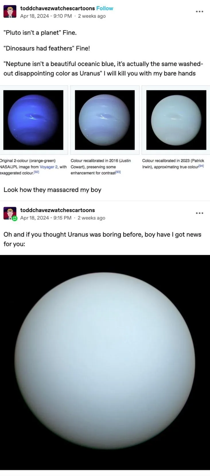
Yeah so maybe both Neptune and Uranus look hazy and dull green in visible light. So what?! They’re both entire worlds, significantly larger and vastly different in climate and tilt and composition and weather phenomena than our own, and we’re lucky enough to have seen them up close with probes. They have layered structure that can be seen in other wavelengths (e.g. infrared) and so many mysteries we haven’t yet conceived. Plus a ton of moons each that are weird and fascinating in their own right. They’re not the least bit boring to a curious mind.
Plus they are gas planets. Fart miners are about to be rich with farts.
Your welcome for this contribution of taste and intellect.Honestly it’s the shitpost community so kinda fitting. Too bad your miners won’t find much stinky sulfur after their decade+ journey.
Your comment formed a perfect pressure waveform.

Respiratory therapists only think about one thing and it’s disgusting.
A pip and a peep? You flatter me sir/ma’am.
When the developers thought their model was so far out of the potential view distance of the player they didn’t bother making a texture for it.
How did it take until 2023 to discern the true color of a planet we’ve known about since before humans found Antarctica?
Serious answer: the sensors in telescopes and probes don’t work exactly like human eyes. They pick up a different range of frequencies than our cone cells in the first place, and don’t have the same sort of overlapping input curves. There’s a lot of tricks and techniques in converting an image into the same sort of thing we’d see with the naked eye. You can sorta think of it like translating Japanese into English; there’s no perfect formula and it requires some creative interpretation no matter what.
The popular images that get published all over are simplistic composites and never really reflect the actual data astronomers rely on, so that was never a hindrance to scientific progress. It suddenly made the news because a research group decided to reevaluate the old data and reinterpret it against calibrations from other equipment (e.g. Voyager probe vs. the Very Large Telescope here on Earth). There’s a general interest factor in “wow that looks so much different than the old pictures”, when the underlying data really hasn’t changed.
To add to this, we apparently always knew. The famous blue image is more or less the correct hue, but the saturation has been absolutely blown out like a clickbait youtube thumbnail in order to show faint features more clearly. Somewhere along the line we stopped mentioning that that had been done. Irwin and co just just re-calculated it to get the most accurate version yet, because we’ve got a lot more data to work with now than we did back when Voyager 2 did its fly-by
Sort of? My understanding from reading a handful of articles is that Neptune has a bluish haze layer that’s absent on Uranus, but it’s fairly subtle and the overall color of both is a pretty similar frosty light green. So it’s not just that it got oversaturated but that that particular blue hue got applied to the whole planet and not just a thin layer.
Furthermore, it’s not that the original scientists failed to produce true-color images. The original published images of Neptune had deliberately enhanced colors to better show some of the features of the cloud surface, and the description text of the images said as much. But that nuance was quickly forgotten and everybody just took the deep blue coloring to reflect the actual color of the planet, which spread to depictions of the planet everywhere.
Similar reason why these three photos look like slightly different colors: image sensor type, quality, and postprocessing.
Older images, less accurate. Especially if the type of image a system is capturing is not meant to be consistent with the human eye.
not meant to be consistent with the human eye.
Even then, postprocessing is inevitable.
As the white/gold versus blue/black dress debate showed, our perception of color is heavily influenced by context, and is more than just a simple algorithm of which rods and cone cells were activated while viewing an image.
According to a study 97% of scientists are color blind!
How would they even know unless the ones doing the colour-blindness study are part of the 3%

Uranus can actually be quite fun if you know what you’re doing
literally an entire planet
”it’s boring because of colour!”
TFW you thought you were cool, but it turns out you had a yee yee ass haircut all along.
Just like jeans, the more you wash it, the more it fades.
Don’t plain-shame, being basic is okay too
And Pluto is H.S.
(And so are you!)
This is a billiard ball.
Really? I was thinking ping pong due to the lack of luster…
The bodies of the solar system arents trying except for Jupiter, Saturn, and Earth
Look at this eyesore.
Astronomical photobomber


