

Hi, apologies in the long delay on this release. It took a couple days for Google to approve it and it went through a number of beta rounds before the bugs were ironed out. This release brings swipe customization and a couple new settings. As always thank you everyone for your feedback!
Changes
- Swipe customizations
- Comment navigator now moves to where your previous comment was and not centered
- Image caching should be a bit smarter now and release memory when not in view
- volume navigation now defaults to OFF
- edge to edge display now defaults to OFF
- Image close gestures can now be controlled in settings
- Post card layout UI improvements
- Added setting for double tap to like posts
- Post card is now affected by the ‘handedness’ setting
- The list of moderated communities now shows up in the sidebar
- Adds list of Admins/Mods to the about instance and about community pages
- Current Sort title text is now in the tertiary theme colour to make it stand out a bit more, removed 'via ’ text.
- Added option to see full upvote and downvote counts on post cards
- The top app bar should now appear sooner when scrolling up
- !community markdown now correctly links to a community
- Card view with height limited will crop the image versus displaying the image fitted to the container
Also I’m testing out a fix to some comments not appearing on 1.0.109 beta, let me know how that looks. Next on my list is either drafts or an improved video player.
Edit: 1.0.110 beta changelog
- Adds draft functionality for posts and comments
- Adds video player for most video types (still experimental, working out the bugs on this one)
- Fixed going into comments from the inbox not scrolling the view
Links:
::: Test :::
-kuroneko
Option to make both the comment icon and number on a post open the comments would be great. I basically never want to comment directly on a post without first opening it and I’m constantly fat fingering the icon when I want the number.
Thanks for all your work on this app!
It’s been awesome to see feedback and issue reports being addressed quickly.
If I could make a suggestion, it’d be to have post bodies round off to the nearest word, and end in an ellipsis when they are too long for the post preview. It’s a bit jarring seeing the body of many posts cut off mid word.
Also being able to download an image from the feed without needing to open it would be great.
Thanks for all your work! The app is really good and gets better with every update.
Thanks for the feedback! Agreed about ending at the nearest word, I’ll see what I can do.
Just wanted to say thank you for implementing this. It feels much more natural, so much so that I didn’t notice it until I was scrolling for quite a while.
Does anyone else get inconsistent response by click the comments button on a thread card when viewing a community? I mean this one:
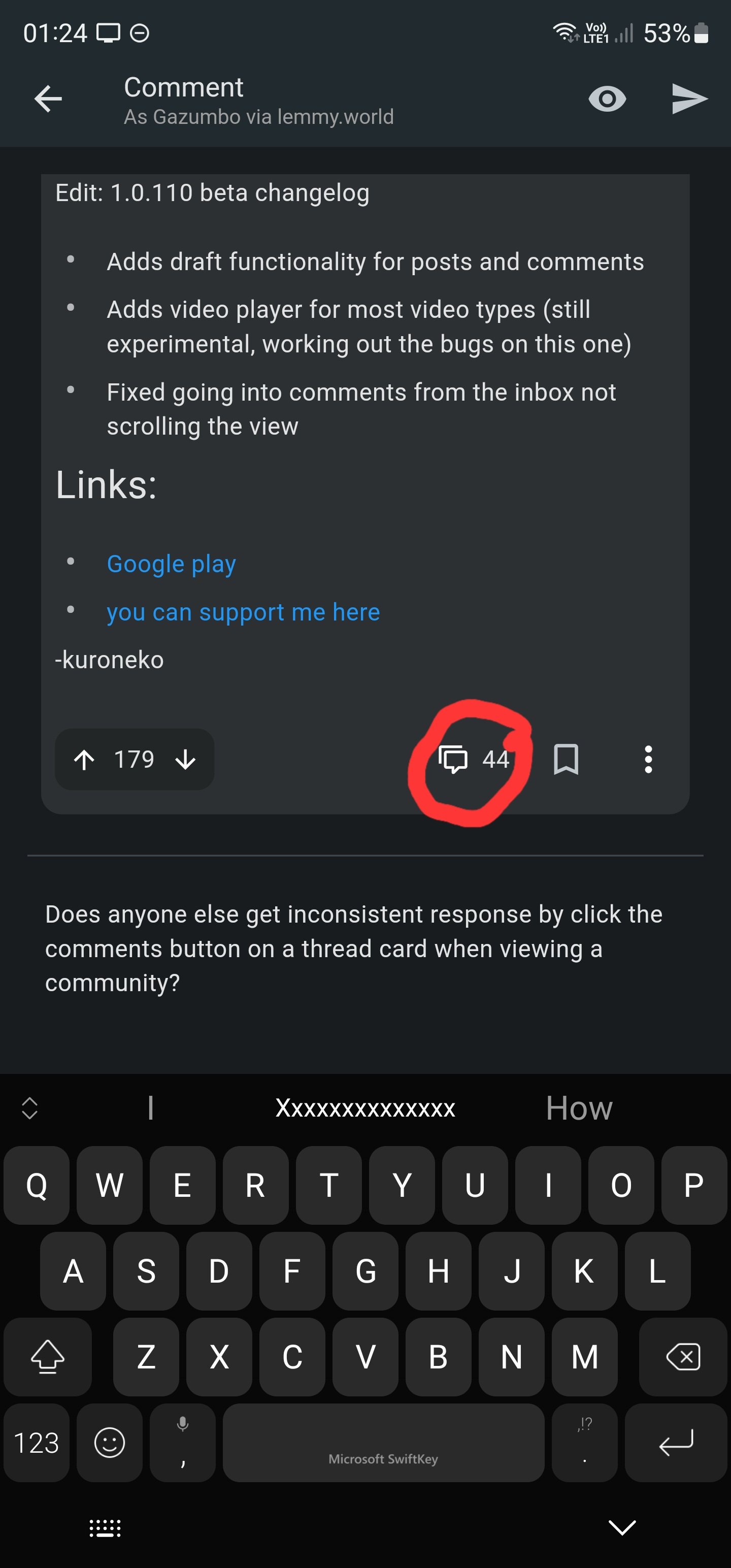
Sometimes it’ll open the the thread and show me the comments. Other times it will open the reply box.
Happens to me too. I’d just like to have an easy to press button to view the comments section.