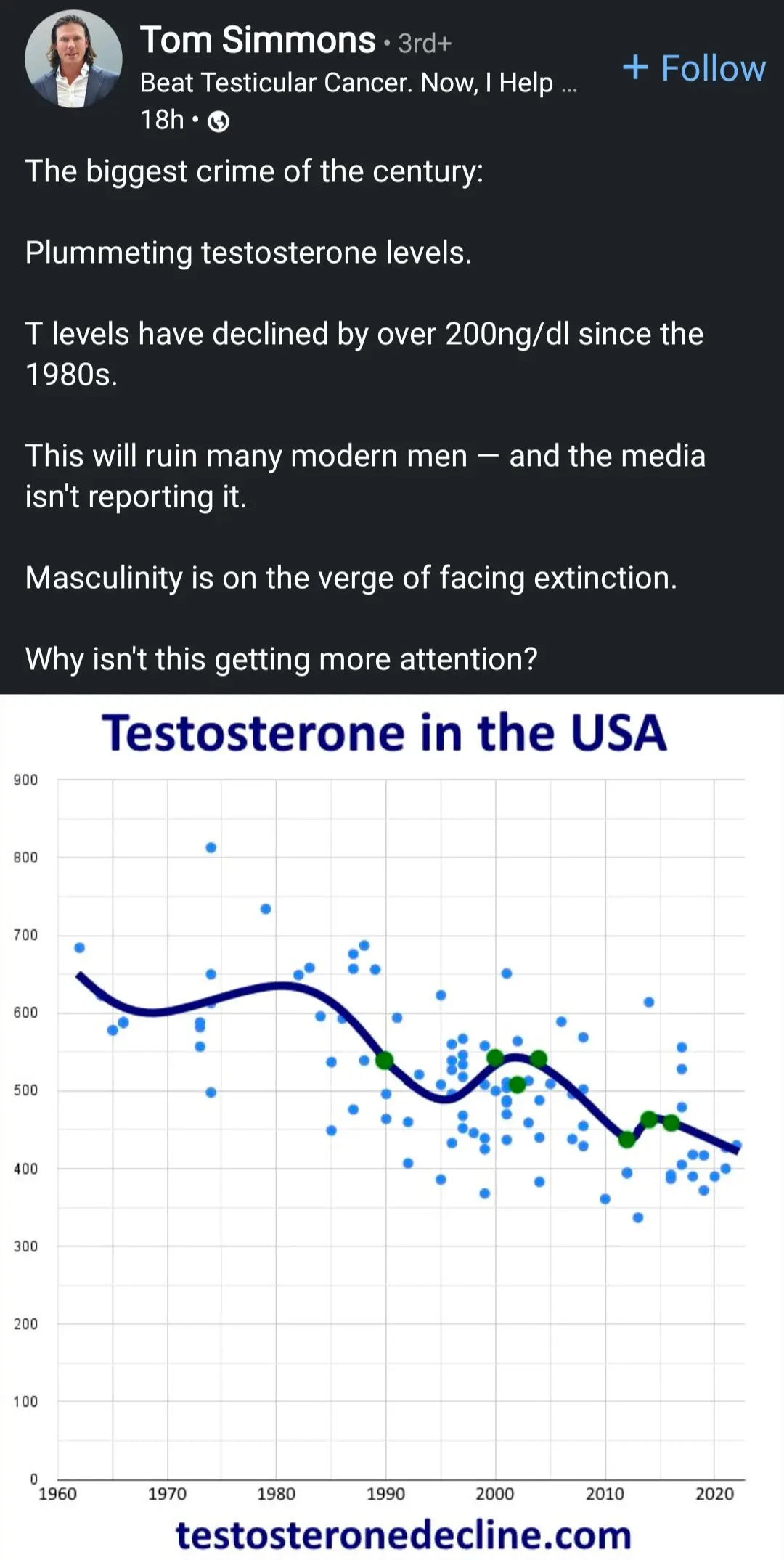
It’s a terrible graph anyway. The outliers haven’t been removed and I completely don’t understand the line of best fit that’s been drawn because it appears to be squiggly. How can it be squiggly, it’s a line of best fit, it’s an approximation. Oh and making some of the points green does not increase their validity.


How much do you want to bet that the source is somebody trying to sell some sort of snake oil claiming to boost testosterone.
It’s a terrible graph anyway. The outliers haven’t been removed and I completely don’t understand the line of best fit that’s been drawn because it appears to be squiggly. How can it be squiggly, it’s a line of best fit, it’s an approximation. Oh and making some of the points green does not increase their validity.