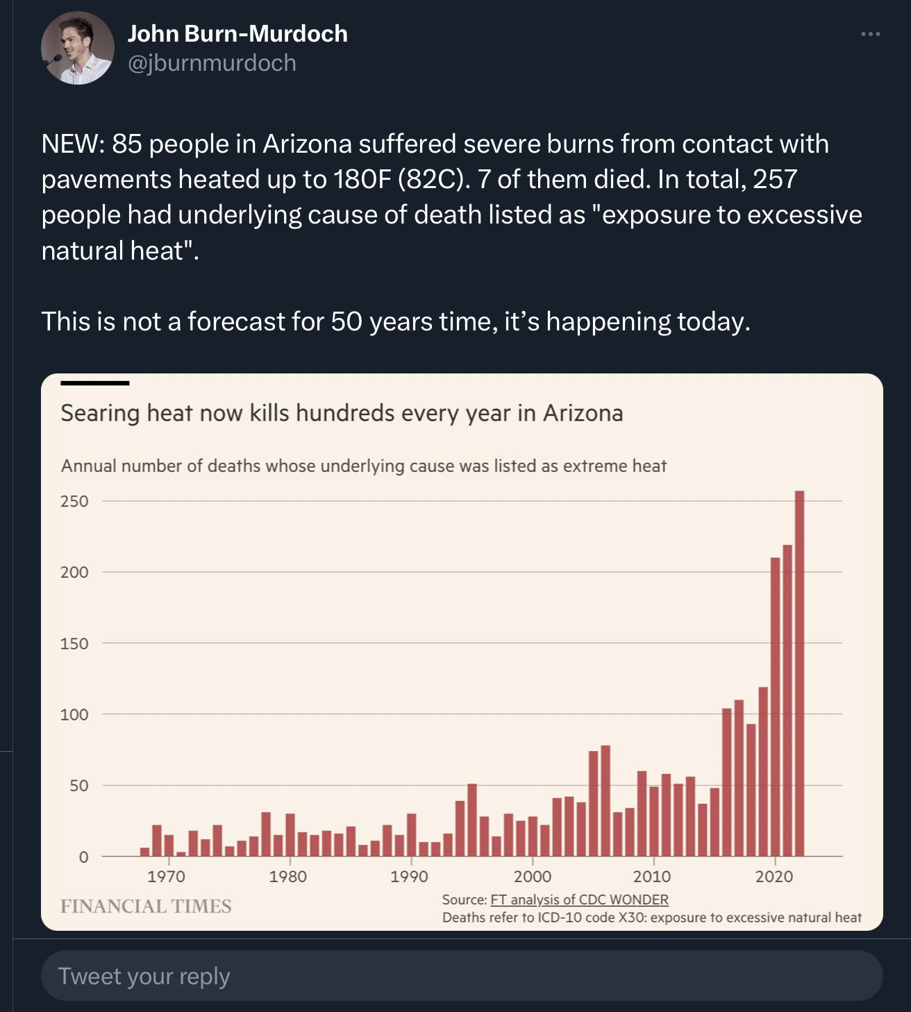
I’m 110% on board with global warming, but this graph is misleading.
The author needs to at least correct for population changes (heat deaths per X residents). Even better would be to account for changing demographics, like age and county. From this random stats website, it looks like there has been a dramatic increase in proportion of older residents since 1970. Old people are more likely to die, so more elders = more deaths.
If I wasn’t about to head to bed, I might try to fix it, but… sleep.
Oh, and I’m pretty sure there has been an increase in small plane crashes in AZ. The hot air is much thinner than most pilots are used to, so they tend to forget accounting for changes in thrust and climb rates. I’m pretty sure a couple happened in just the last few weeks.
And whenever you have a chart of historical data like this, you have to at least consider that an increase could be reflective of either improved diagnostic or record-keeping abilities.